
This week, Ritva Sillanmäki leads the Lens-Artists Challenge with the topic, Choose a Color. ” . . . select one color (excluding black and white)”. . . “where your chosen color is the prominent hue . . .”
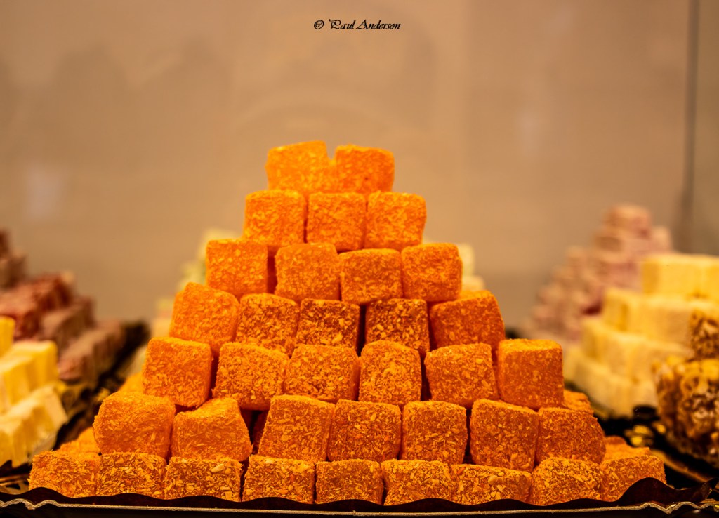
In the hills of Granada is the Moorish district called the Albaicin. It is a free for all of hues. In the Albaicin there is no discrimination against any color of the Pantone – they are all represented in spices, clothing, rugs, pottery, various foods and sweets and anything you can imagine. At one confectionary we saw pyramids of Turkish delights.
For this challenge, I relied heavily on the plant world. All of the florals below were taken at the San Francisco Botanical Garden during the latter days of COVID.
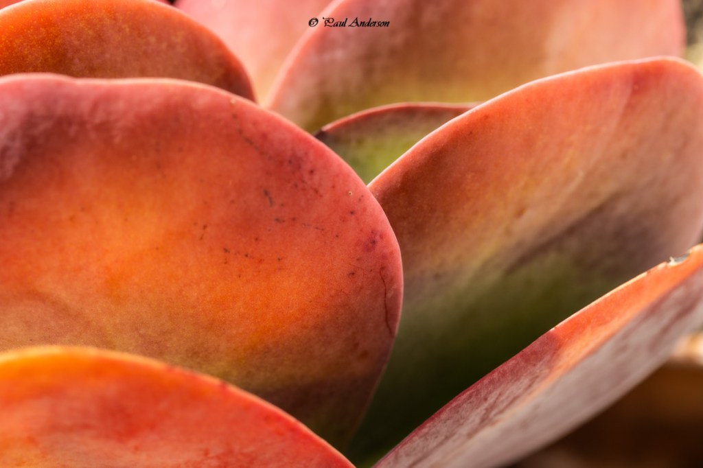
The kalanchoe thyrsiflora is a succulent, native to southern Africa. It’s also called the “paddle plant.” Hmm, I wonder why?
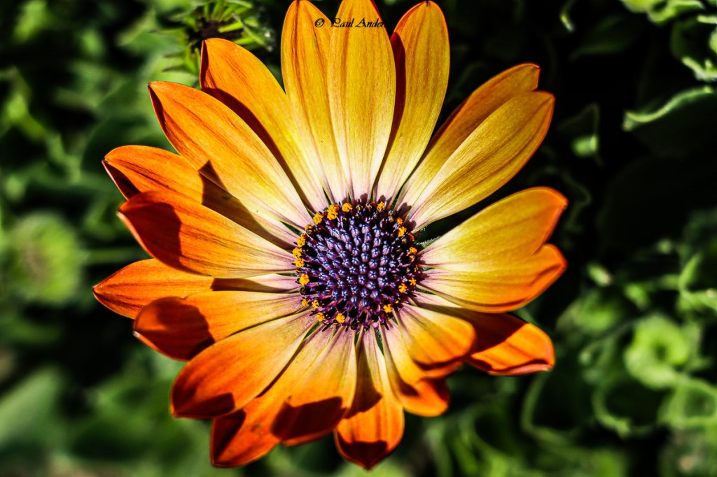
The purple and orange in the river daisy (below) make a stunning couple.
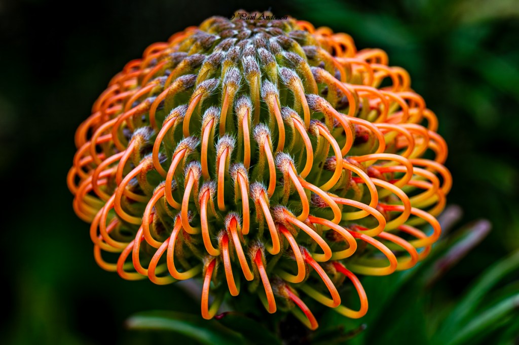
The pincushion protea is quite splashy.
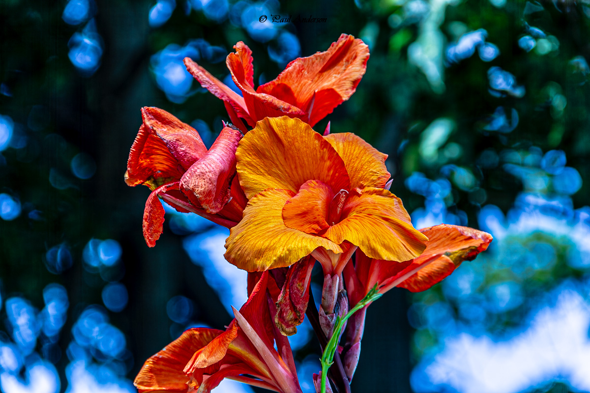
As is the canna lily below.

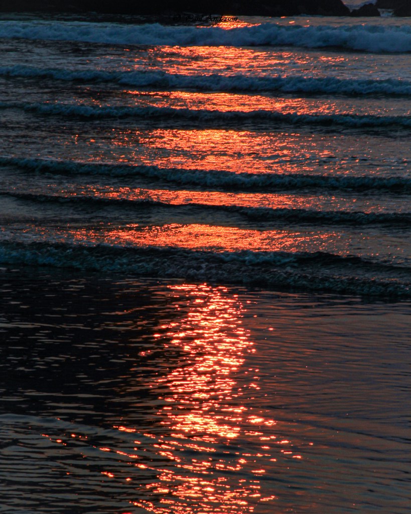
And finally, this post is riding off into the sunset.
Before leaving click here to check out Ritva’s stunning images.

Beautiful photography for this challenge Paul. Loved it!
LikeLiked by 1 person
Thank you Anne
LikeLiked by 1 person
I also love Orange, and that would’ve been my other choice. You have some beautiful examples here.
LikeLiked by 1 person
Thank you Teresa.
LikeLiked by 1 person
Marvellous. You’ve shown the rich subtlety of orange, which can come off as a bit brash.
LikeLiked by 1 person
Thank you Margaret.
LikeLiked by 1 person
So warm and inviting. I particularly love your macros.
LikeLiked by 1 person
Hello Sofia, Thank you for the kind words. I really haven’t taken out the macro lens in some time. Maybe dating back to COVID. Maybe it’s time to dust it off.
LikeLiked by 1 person
I think it is, yes 🙂
LikeLike
I must admit Paul that orange is not my favorite color but you have made me reconsider! Loved all of your choices for this week, especially the protea and the paddle plant. And who doesn’t love a beautiful sunset on the water. Lovely choices for the week.
LikeLiked by 1 person
Hi Tina. To be quite honest it isn’t my favorite color either, but it just so happened that orange had the most qualified candidates. Thank you for the kind words.
Paul
LikeLike
Paul, I love the vibrant orange, and the older I get the more I love it Your photos are wonderful. The the “paddle plant and The pincushion protea both as photographs and plants stood out to me.
LikeLiked by 1 person
Thank you Ritva. Our botanical garden in San Francisco is a wonderful place to bring a camera and spend a leisurely time taking pictures and discovering new flowers and plants. Thank you for visiting.
LikeLiked by 1 person
Orange is the new red.
Love the colour, and I think it’s the hue of 2026. You show it well!
LikeLiked by 1 person
Thank you Eden. Lightroom agrees with you. When I did a search for colors in my LR catalog, Orange came up big, so I went with that. I’m not a giant fan of the color though it is a color of the San Francisco Giants.
Thank you for reading and commenting
Paul
LikeLike
These are all gorgeously vibrant and beautiful, Paul. Orange – a colour I never liked as a young girl, but now that I am aging I find it intriguing. I even wear orange nowadays!
LikeLiked by 1 person
Hello Anne-Christine. Thank you so much for visiting and for the kind words
LikeLiked by 1 person